Friday, 26 December 2014
Friday, 5 December 2014
case studies 1
 this album cover is simplistic. It has a close up shot of the Artist.This will mean people will see it is drake as he is a iconic recognisable figure.Like his other album covers he is not facing the camera as he is staring in the other direction it creates a suspenseful effect. The fact that there is a blue color scheme with white clouds in the back create a peaceful effect.
At the bottum drakes name is written with the colour matching the album colour scheme. There is also a parental advisor warning sticker in order to let people know that the language is very explicit as with most rap albums.
 The inside cover is consitent with the front cover. However the backcover is not. It has a black and white colour scheme. With the tfack list positioned to the middle in a clear readable font so that it can be seen for the buyer. To the right is the media institutions information such as the publishers and record companies associated with the artist. Along with a bar code that is unique for that particular cd.
case study 4
The choice of font on this album poster is effective as it is bold and big. This enables the title and the artists name to be easily seen to attract buyers. The information telling when the album is going to be available in written in big white font whereas information on the record companies is written in small font. The artist is in the centre in a collage of bright colours. The fact that there are many little pieces which appear to be breaking apart relate to the name of the album "relapse".
The use of a rehab medical card on the right side of the poster links with the title as it could represent the artist falling back into old ways and needing medical help
Monday, 1 December 2014
Saturday, 29 November 2014
Audience feedback
I asked a friend what they thought of my groups video and here is there response.
Friday, 21 November 2014
Editing continued
We gained extra footage outside of our local areas of flashing lights and people we then added this to our footage to film the time gap
GIFS of effects used
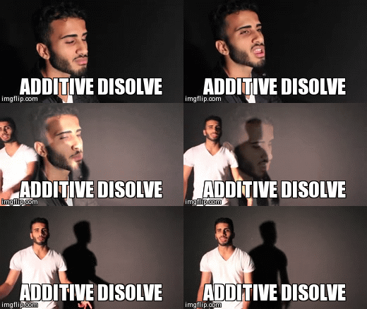
Above is a highlighted dissolve effect.Our audience found this effect very appealing and thought it worked well. In particular shots within the studio.
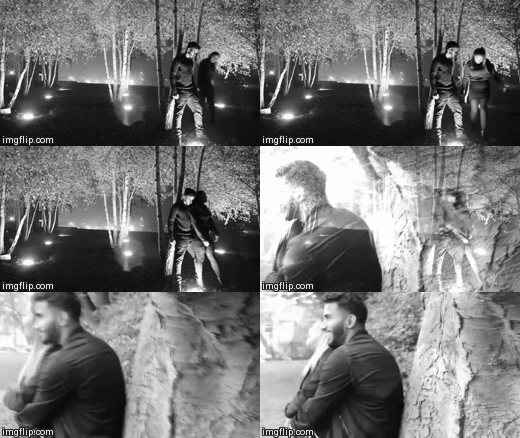
My group has used The GIF to increase the speed by 200% and reduced the other clip by 50%. By desatuating both of them it has enabled us to show that it is a flashback in a fragmented manor. The audience gave a positive feedback, they enjoyed the angles of the shots which are establishing and tracking.
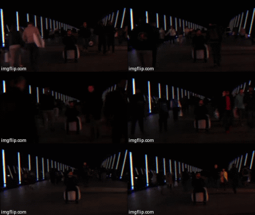
We expanded the time lapse speed to 300%. This is a great shot as it is a period lapse shot which is interesting in contrast with different shots. our Viewers felt this was great as Morshed had to stay in one position for five minutes to make it successful.
Monday, 17 November 2014
editing continued
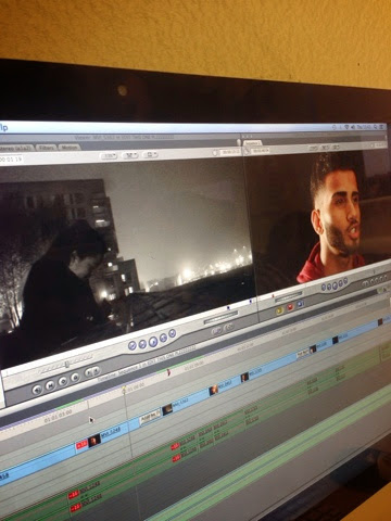
We had to gain extra footage in order to show more of the couple. we used filters such as sharpening effect to give our video a professional factor we are just wrapping everything up and adding more footage to our timeline. So far we are pleased with everything. It has been a long process. At several points we had to restart editing as our work kept getting lost. But with the help of the media technician we recovered it and were back on track
Tuesday, 11 November 2014
work in progress
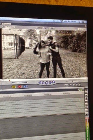
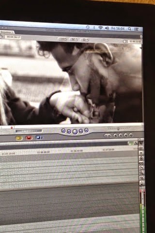
In these shots we made sure to focus on the emotions of the actors so that they appeared close. we used black and white for the flashbacks and the video was played in slow motion in order to match the slow parts of the song and make the audience feel the emotion behind the break up.
we did more editing today it was challenging as we lost some of our work but the video is coming along well
Thursday, 6 November 2014
mirror effect
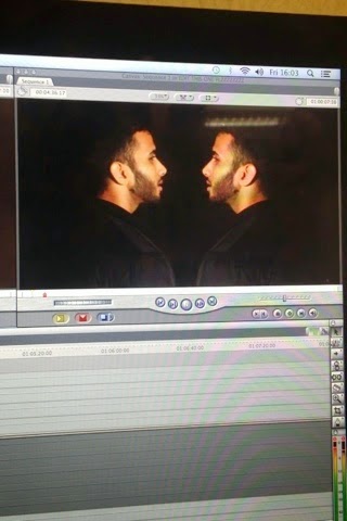
With Morshed's expertise the group was able to flip the video which enabled us to merge it on final cut pro using the "flop" effect. There was a slight problem as the noses of the clips were touching.
to solve this they had to be pulled apart and use the crop tool to drag them further away on a separate smaller screen
Wednesday, 5 November 2014
Editing the video Final Cut Pro
There my group has used final cut pro to duplicate the same clip and by cropping it into equal parts and uniting them making it mirror. The left clip is played first, we then stopped the frame allowing the second clip to carry on where the first left off
Tuesday, 4 November 2014
Actors and Mis en Scene
Actors and mise en scene
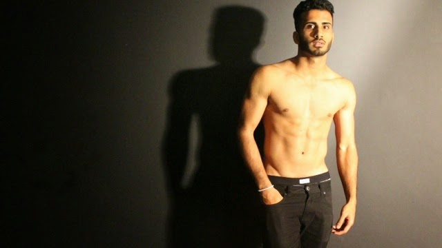
we nominated morshed to play the boyfriend. This is because he is in our group therefor we could count on him to be reliable. morshed also has prior experience in acting and performing. He also had the charisma and swagger in order to give a sexual appeal to our female target audience. My job in the group was to then aid in constructing possible shots for the story boards and concepts.
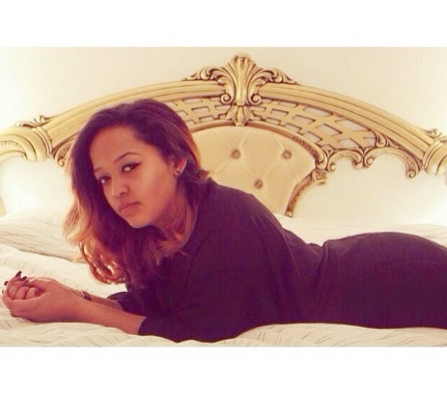
The role of the girlfriend was appointed to Monica. who is a close friend of Morshed. Many of the girls we wanted to use were unreliable so we decided to use Monica. the fact that she knew Morshed was an advantage as it meant that she would not be uncomfortable around him as they would need to get close in certain scenes. She was instructed to wear something in which she felt comfortable in as if she was not it would show on camera. the bedroom scene was shot in her home where she was most comfortable
Sunday, 2 November 2014
Location 1 westfield Blury Lights
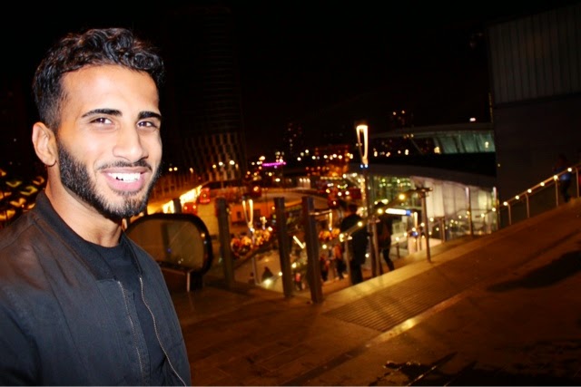
This picture was taken at the first outdoor location which was taken before the city and blury car lights brought in during the rap. Though it came out professional due to poor lighting which was uncontrollable. However due to the picture coming out so well it could be used as a potential CD cover
Friday, 24 October 2014
Thursday, 23 October 2014
group contact
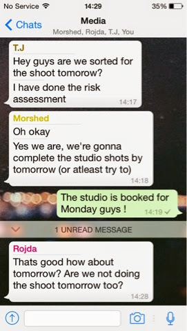
me and my group also had to communicate outside of lesson in order to complete tasks here is a group chat of us doing so

our story board
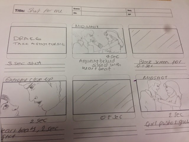
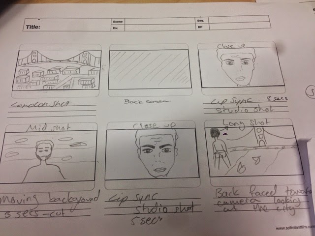
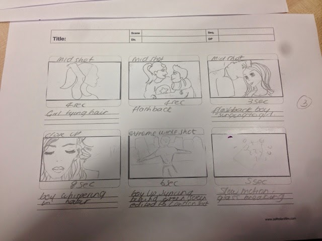
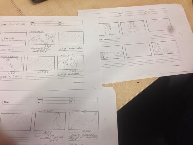

After annoting the sheet me and my group transferred it to a shot by shot story board so we were prepared for when we shoot and waste no time
locations

This is one of our possible locations to shoot, It is in stratford so it is close and convineint. Due to it being a public area we wont need to gain any permission. At ight the area looks lovely so we weill be able to gain the flashing lights effect that we are seeking. Because its outside asnd public it will look more realistic
Here is a park which we may use to shoot the break up scene. we have decided to do a park because its convenient and it is common for couples to go ton the park on walks. We discussed using a black and white effect in order to make the flashback scenes more effective and connect with the audience better.We also considered using a park because it is a public area which we wouldn't need consent for.
Wednesday, 22 October 2014
practice shots
Today we went to the studio took some shots tot est the lighting. This wont be used for the video or print products but it helped us see what we would need to do to get the right effects we want to do for our studio scenes
Monday, 6 October 2014
first stage of pre production
Our first stage of pre production was to plan what we were to do and what we would have the actors doing therefore the would mbe no confusion when it comes to filming as we would have already planned what to do. After this we would then transfer our plans from here to a story board
Monday, 22 September 2014
Seeking consent
Here is a email I wrote to the ceo of the artists label seeking consent to use the song in our music video
Wednesday, 17 September 2014
Monday, 15 September 2014
Treatment/pitch
Here is a video of our pitch. We presented this to our class mates and explained our initial ideas and concepts to them.
from this pitch we gained a lot of feedback which was really helpful. They told us they liked our ideas especially the rewind and time lapse. This helped us because it reassured us that we were headed in the right direction. They also liked the actual plot for the narrative.
However, the audience were concerned about us using Morshed as the actor when we had the option of choosing another. They were concerned that he would get too caught up in the acting and not the production.We took note of this and assured them that having Morshed as our actor was an advantage.This is because of him being apart of our group which would mean he would be committed and reliable.
They were also concerned that we would focus too much on the effects than the narrative, we took this feedback positively and made sure to not make that mistake.We still planned to have alopt of editing effects but to have footage to match as well. Me and my group felt that using the effects would give us the ability to enhance and build the narrative.
our audience also suggested places we could shoot which we would take into account within the pre production. They also gave us the names of videos that did the same effect as we planned to do. This was effective because it showed us possible ways how we could do it.
It was brought to our attention that in order to film in one of our locations that consent would need to be given which has now been taken into consideration. From that we decided to use public places for our locations for shooting this as it will be more realistic and appeal to the audience as well as that there is no need for consent.
Wednesday, 10 September 2014
Subscribe to:
Comments (Atom)


